MIRROR WORKS
MIRROR WORKS sells a surface finished only when light lies flat, exposing correction, ceramic, and interior stages rather than before-after alone.

01 · Direction
The showroom organises by stage, defect, and protection level, using reflection diagrams to prove detailing craft.
The brief is to make an editorial fashion retail website that creates desire and helps visitors decide without assembling information from several places. MIRROR WORKS is therefore treated as a content and conversion system, not a collection of attractive screens.
Clients choose car, condition, and goal, upload guided images, and receive scope, time, and price range before booking.
“For MIRROR WORKS, aesthetics earn their place only when they make design, craft, material, and use context easier to see, understand, and act on.”
- Format
- editorial fashion retail website concept
- Audience
- Shoppers interested in product, material, and brand world together
- Primary proof
- Design, craft, material, and use context
- Primary action
- Explore a collection, inspect a product, or book a fitting
02 · Thestages
Thestages should tell visitors what is worth remembering.
Thestages extends the hero promise into a situation a visitor can picture. For MIRROR WORKS, the content needs to show what happens, why the detail differs, and which information matters enough to continue exploring.
In production, this module should offer a short scanning layer, deeper verification for people who need it, and a clear route forward. That structure preserves editorial pace without sacrificing search discovery or accessibility.
Principle: every artboard must add a reason to believe or a reason to act.
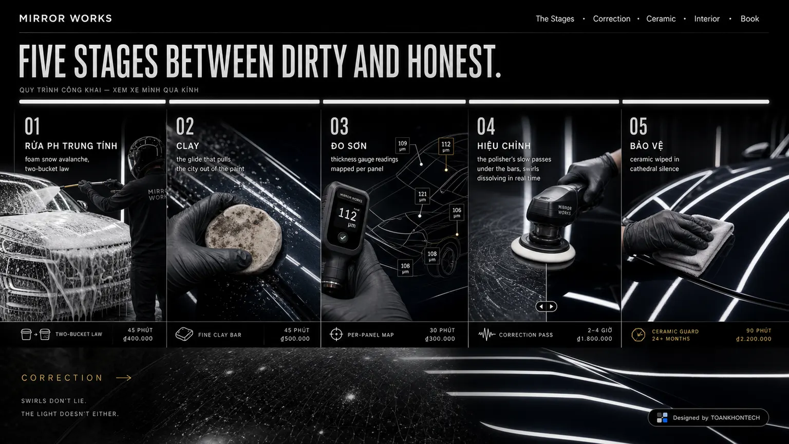
03 · Correction
Correction is not filler; it is evidence.
Correction is an evidence layer for MIRROR WORKS's positioning. Instead of adding adjectives, the artboard uses design, craft, material, and use context to turn a visual impression into a reason visitors can remember and compare.
Every claim should carry a source, scope, and update date where relevant. That becomes essential when a concept moves towards production: trust comes from verifiable detail, not the volume of brand language.
Principle: every artboard must add a reason to believe or a reason to act.

04 · Ceramic
Place ceramic at the right moment in the decision.
At the centre of the journey, ceramic classifies choices and reduces cognitive load. Primary information should scan in seconds; secondary detail opens after visitors know what they care about.
Headings, image captions, and contextual links also help search engines understand the page without keyword repetition. SEO is the outcome of clear information, not a text layer added after design.
Principle: every artboard must add a reason to believe or a reason to act.

05 · Interior
Interior connects brand story to action.
Interior sits close to the moment a visitor considers “Explore a collection, inspect a product, or book a fitting”. The artboard therefore keeps brand emotion while making conditions, the next step, and the post-click outcome explicit.
A live version should measure the primary action and hesitation signals: returning to an earlier section, opening support information, or leaving at a particular field. Those signals reveal missing content before button colour or CTA wording is optimised.
Principle: every artboard must add a reason to believe or a reason to act.

06 · closing invitation
Close with closing invitation, not an empty button.
closing invitation closes the story by recalling value already shown rather than placing a button in empty space. Visitors should see a next action that fits the context and be able to return to decision information without losing position.
The final invitation should retain the spirit of “When the light lies flat, we're done” while stating response time, required information, and alternatives. A good ending lowers uncertainty; it does not create artificial pressure.
Principle: every artboard must add a reason to believe or a reason to act.

Design language
Recognise MIRROR WORKS before the logo has to appear.
The design language follows a use-case showroom treatment, the concept palette, and its native image rhythm. The goal is not novelty in every section but a small set of rules strong enough to support new content.
- 01
Contrast with a job
Accent colour is reserved for attention and primary action; background, type, and imagery stay stable so MIRROR WORKS never becomes noise.
- 02
An industry-specific rhythm
Image ratio, paragraph length, and headline placement follow how people actually explore an editorial fashion retail website, not a universal portfolio template.
- 03
Evidence before invitation
Design, craft, material, and use context arrives before the CTA, making action a reasonable consequence of the story rather than an interruption.
Colour system
#000000
#282828
#505050
#686868
#001030
Colours come directly from MIRROR WORKS's art direction. Production should validate WCAG contrast for copy, interaction states, and charts instead of assigning every colour equal weight.
Production direction
Turn the concept into a system with content, data, and clear ownership.
The visual design is an opening hypothesis. A live version must be tested with real content, real behaviour, and the technical constraints of the team that will maintain it.
- 01
Inventory content and data
Identify the source, update cadence, and approver for design, craft, material, and use context before finalising page architecture.
- 02
Prototype the primary flow
Test “Explore a collection, inspect a product, or book a fitting” on real devices, including missing data, failure, and interrupted-return states.
- 03
Performance and access
Serve images at display size, preserve semantic HTML, support keyboard use, and respect reduced motion so the experience does not require powerful hardware.
- 04
Measure what matters
Track lookbook depth, product views, purchase, and appointment intent, exclude internal traffic, and agree event definitions before interpreting results.
Frequently asked questions
Questions to resolve before producing MIRROR WORKS.
- Who is MIRROR WORKS designed for?
- Shoppers interested in product, material, and brand world together. Every layout decision serves one primary action: explore a collection, inspect a product, or book a fitting.
- Why does this detail page differ from the other concepts?
- The use-case showroom treatment follows how people explore an editorial fashion retail website, its information density, and its particular visual language.
- Could the concept become a real website?
- Yes, after replacing assumptions with real content, data, legal requirements, and the organisation's “Explore a collection, inspect a product, or book a fitting” process.
- How should effectiveness be measured?
- A useful starting set is lookbook depth, product views, purchase, and appointment intent; final targets must follow the real operating model.
Continue exploring
More concepts in the field, each with a different answer.
From concept to product
Have an idea that needs to become a real website?
ToanKhonTech can shape positioning, content architecture, conversion flow, and an interface system for your actual context—without copying a concept wholesale.